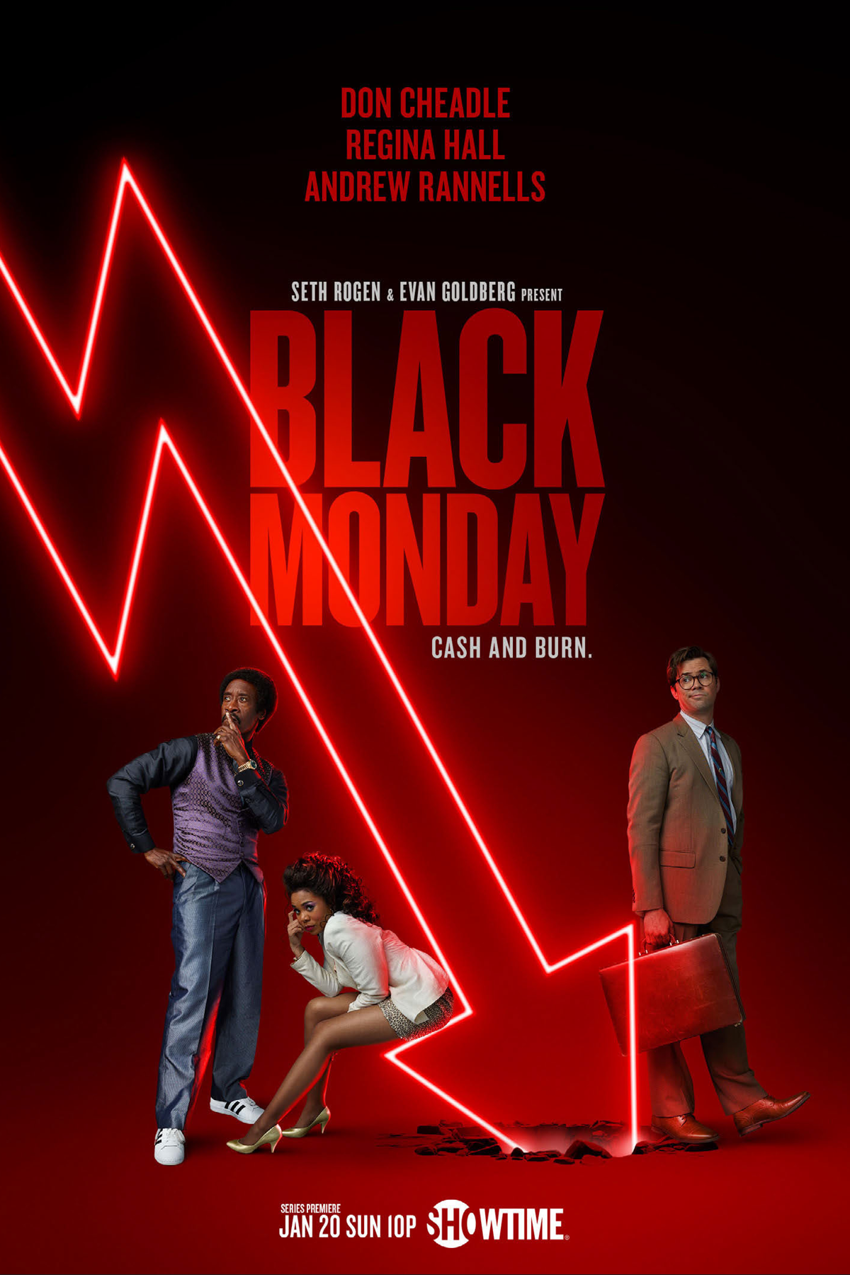
Black Monday
Objective
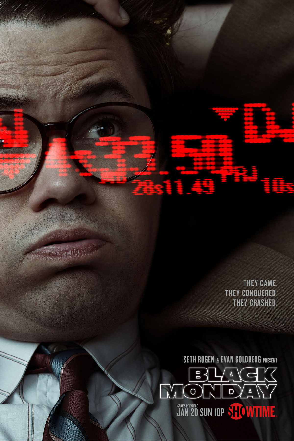
Being known as a destination for premium dramas, Showtime committed to expanding into the comedy arena in 2019. The first show to do so was Black Monday. It chronicled 360 days leading up to October 19, 1987, the biggest stock market crash since 1929.
Approach
After an initial exploration, we worked closely with Seth Rogan, Jordan Cahan, and David Caspe on mood and tone. We decided early on to bypass well-worn comedy tropes and developed creative to be unironic, similar to Rogan’s Neighbors.
Role
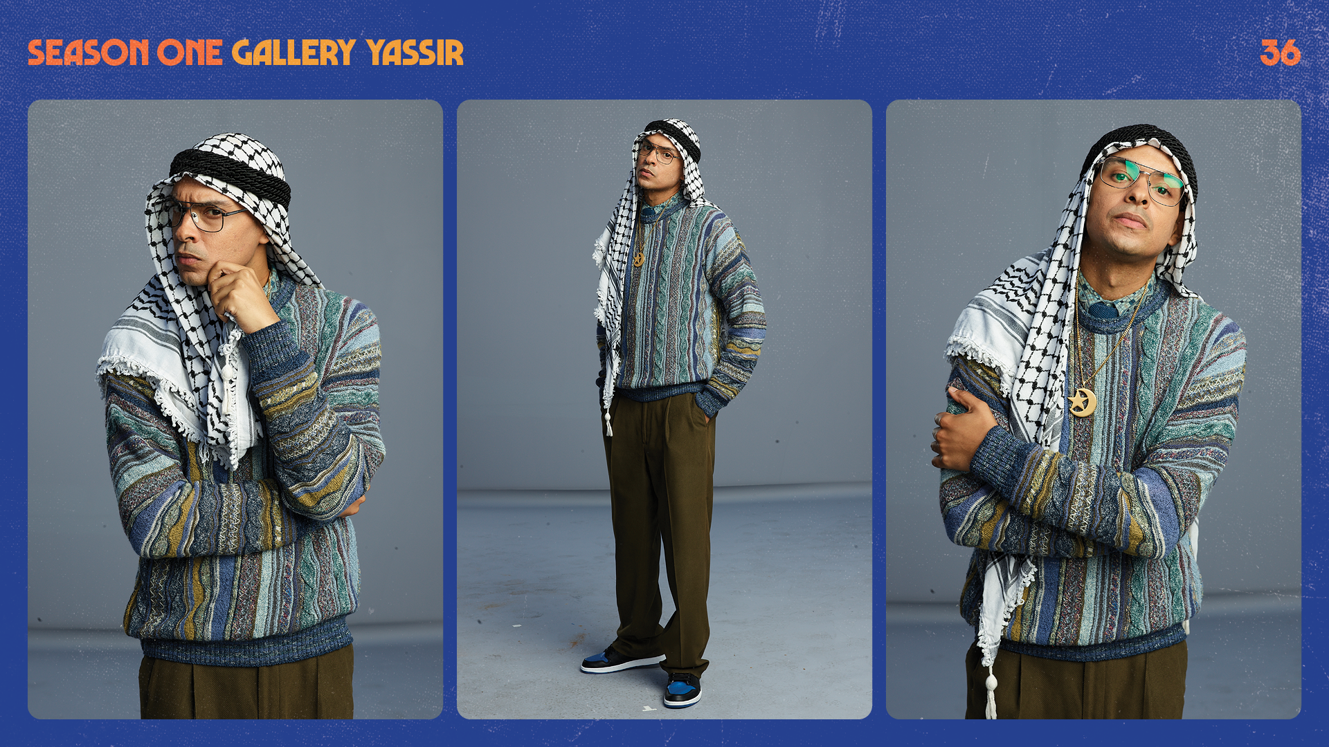
I was the creative design lead on the pilot and subsequent three seasons of Black Monday. Along the way, I collaborated with several 360 agencies, directed all photography, and managed internal teams to create assets for print, on-air, out-of-home, digital, and social use.
But first, the initial exploration…
The original brief was to lean heavily into the eighties-ness of the show. Working with Concept Arts, we explored tropes mined from Oliver Stone’s Wall Street, Working Girl, the artist Patrick Nagel, and others.


The Lookbook
Following a series of productive EP meetings we clarified a visual language by sharing images back and forth and seeing what resonated.


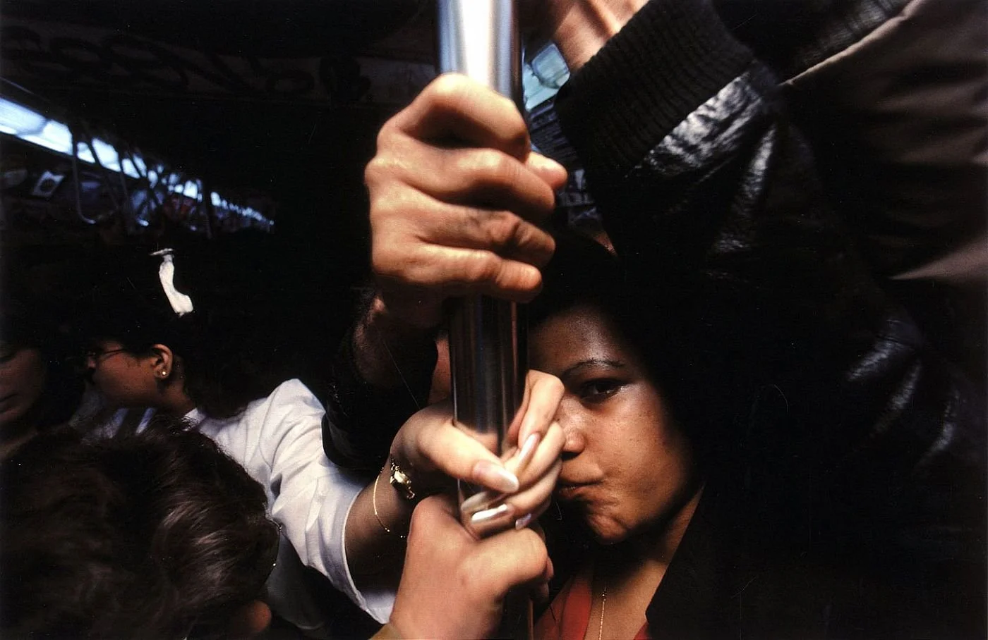


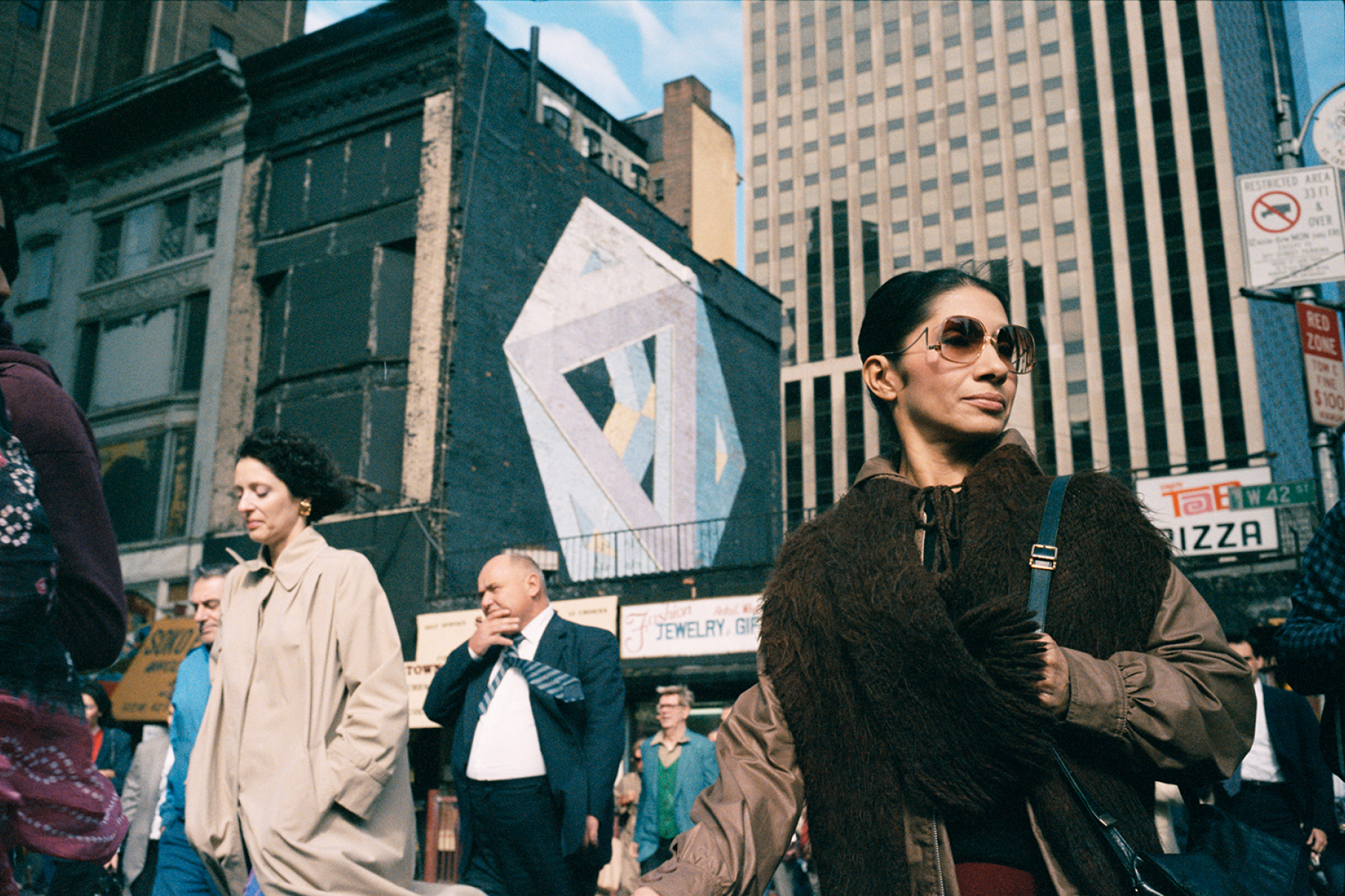
Midtown 85
One of the photographers we offered to the EP’s gave us the inspiration to … As a student in xxx Michael Lavine scents afternoons with a camera this hip, randomly shooting passersby in October when the light created the most amazing shadows.


The Logos
For the launch, we created a vintage sitcom logo and brought back the late 80’s era Showtime logo. Read the Variety article here.


“VHS” press kit

42nd street shuttle wrap


Vintage Newport teaser


Marketing press kit


Interim key art


S3 packaging
Photography overview book
In the lead-up to season 3, we collected shots from all three photo shoots to determine if a new one would be necessary. Acting as a photographic style guide, it became a valuable resource for new employees and the press department. It was also helpful in reviewing the photographer’s work.